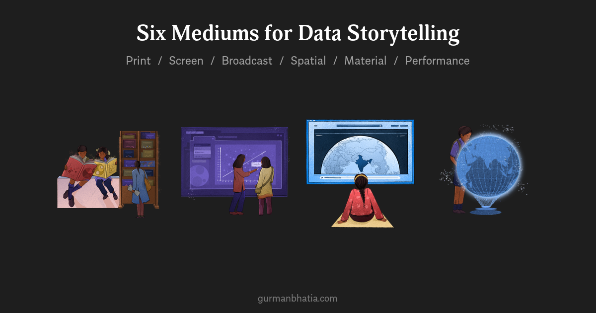
The Medium Is the Message: Six Mediums for Data Storytelling
I studied Journalism in my college. And in my Media Theory class, my professor Bindu Menon introduced us to Marshall McLuhan.
“The medium is the message”
We have heard the quote many times before. But recently I started thinking about it from the lens of data stories. And realised how much it also applies to what we do.
If you think about it, experiencing the same message as a poster is very different from experiencing it as a book. Which is very different from a video. Which is very different from a play. The content might be identical. The experience never is.
This is the core of what I teach in the Exploring Different Mediums lesson of my free course on Open Visualisation Academy, a platform created by Alberto Cairo. And it starts with a distinction that sounds simple but changes how you think about format choices.
Medium is not equal to form. Print is a medium. A newspaper is a form. One medium can have many, many forms. Once you internalise this, you stop defaulting to “let’s make a dashboard” or “let’s make an infographic” and start asking a better question: what medium does this story need?
Here are six mediums I use to think about this: Print, Screen, Broadcast, Spatial, Material, and Performance.
1. Print
Sequential. Private. Low-tempo. Reflective. You can re-read it, archive it, hold it in your hands. Once printed, it is fixed.
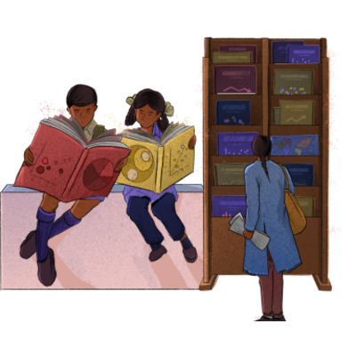
Print includes books, reports, magazines, newspapers, pamphlets, zines, printed posters, printed maps. What unites them is fixedness. Once it’s printed, it doesn’t change. That constraint is also its power. A printed report asks for a different kind of commitment from the reader than a scrollable webpage.
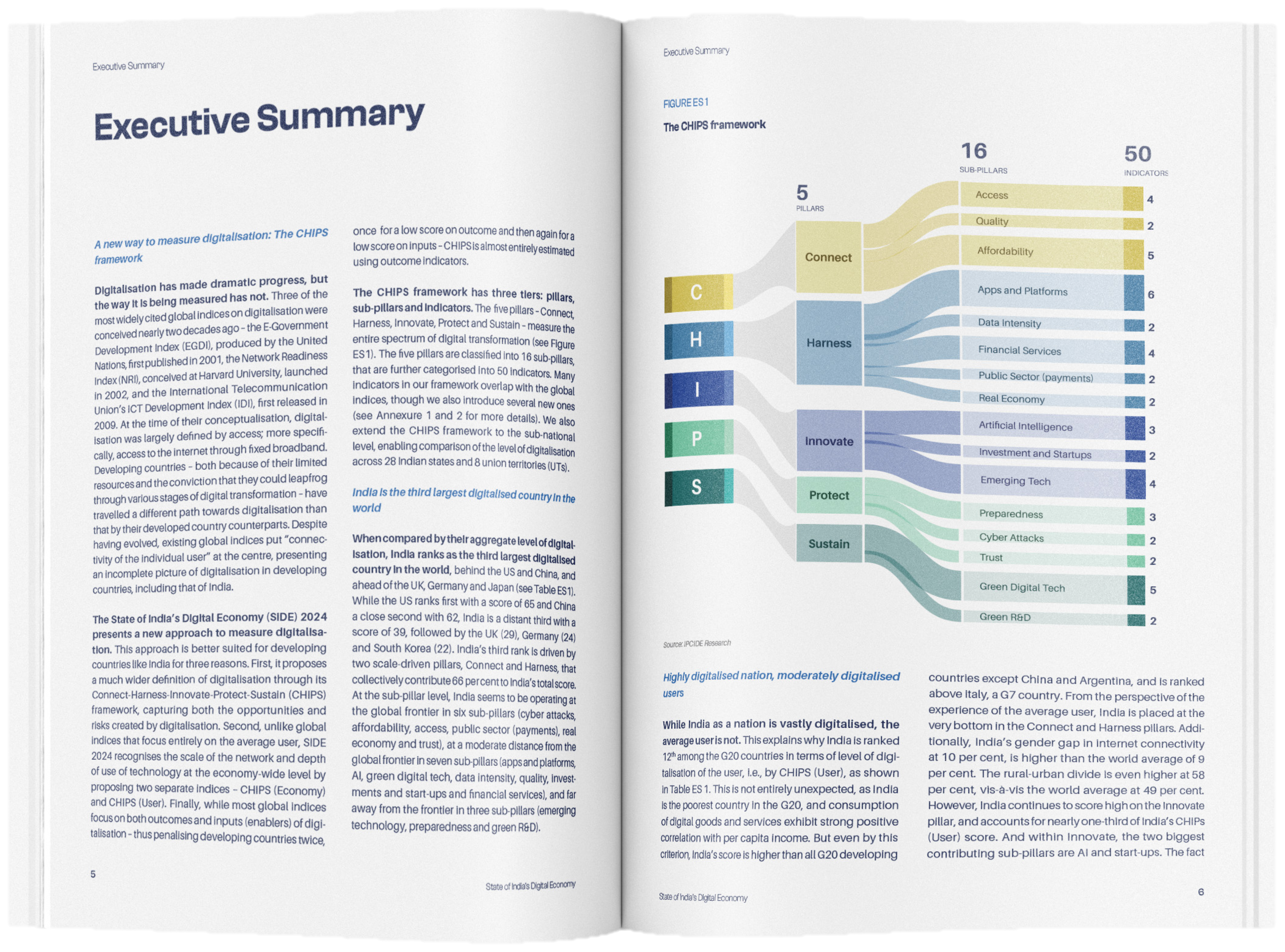 Revisual Labs for ICRIER
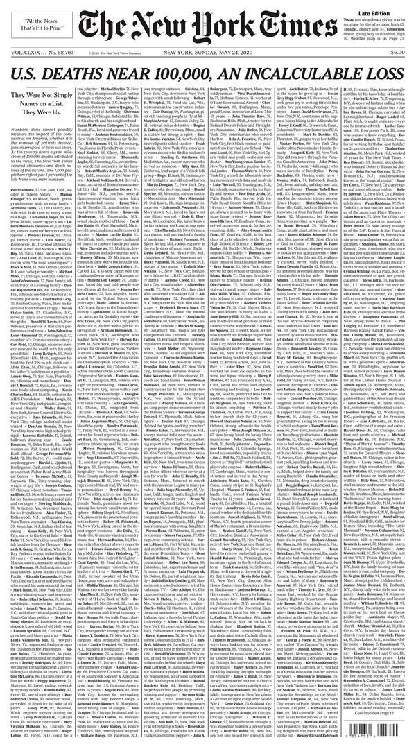 The New York Times, “U.S. Deaths Near 100,000, An Incalculable Loss,” May 24, 2020
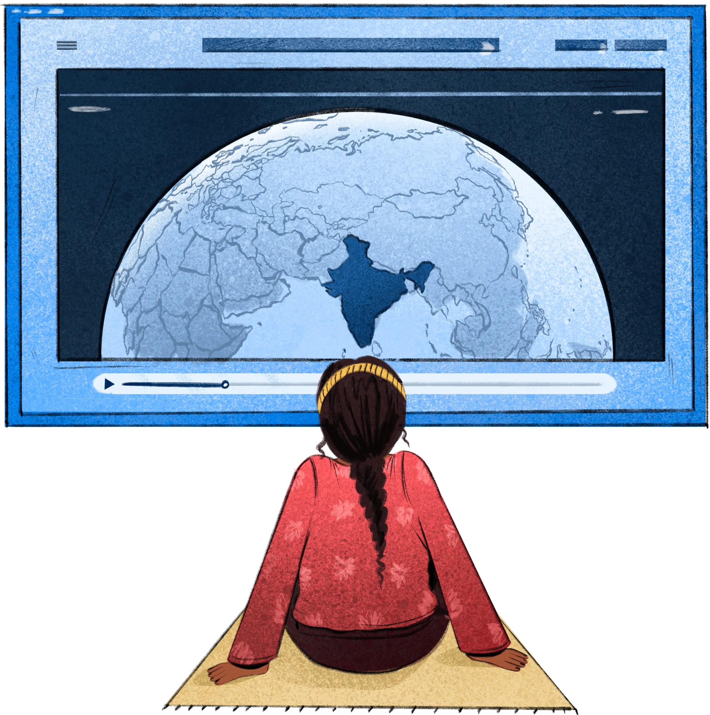
2. Screen
Interactive. Navigational. Updateable. The designer shapes the path, but the user controls the pace.
This is the medium most of us in data visualisation default to. Websites, dashboards, apps, blogs, reels, carousels, long-form video, e-readers, smartwatches, kiosks. It’s where I’ve done the bulk of my work, from scrollytelling about India’s dairy cold chain for WWF to interactive stories about river restoration. But “screen” is enormous. A weather app and a scrollytelling piece are both screen-based, but they demand completely different design thinking. The medium is the same; the forms are wildly different.
EH360, Revisual Labs for EPIC World Foundation
3. Broadcast
One-to-many. Time-bound. Passive reception. The creator controls the tempo entirely, and the audience is along for the ride.
TV, radio, news bulletins, documentaries, cinema, live sports. When cricket match graphics flash a stat during a boundary replay, that’s data storytelling in broadcast. You have maybe three seconds before it’s gone.
Fox Sports
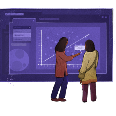
4. Spatial
Co-located with the data. Physically navigable. The space itself becomes the narrative: how you move through it determines what you experience.
Exhibitions, galleries, public data walls, train station storytelling. Spatial is the medium where architecture and information design collide. How people move through a room becomes part of the narrative. You’re not scrolling, you’re walking. The sequence isn’t determined by a page layout but by how a body moves through space.
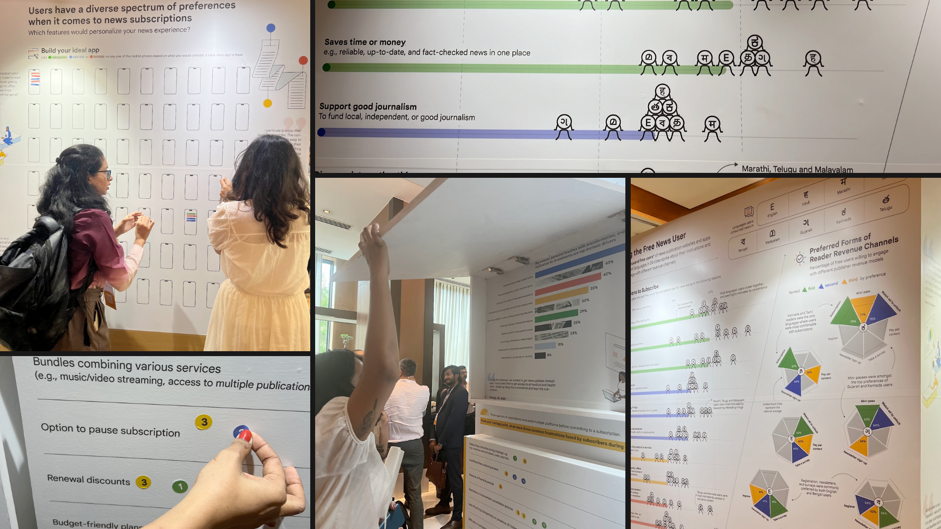 Revisual Labs for Google News Summit
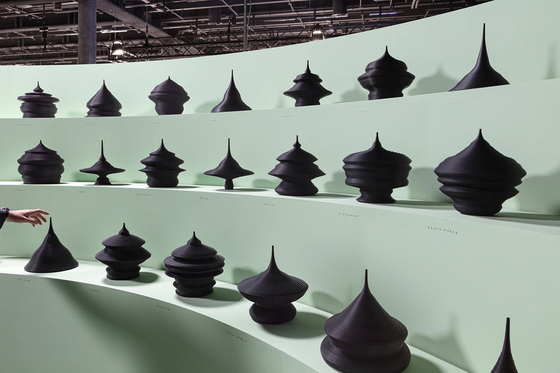 State of the World as Population Pyramids by Mathieu Lehanneur
5. Material
Tactile. Textured. Slow. Intimate. You can’t skim it. Texture becomes a variable, and the data asks to be touched, not just seen.
This is the medium that surprises people the most when I teach it. Data jewellery. Data ceramics. Textiles. 3D printed objects. Physical tokens. Alice Thudt’s Data Potter project turns personal data into ceramic vessels. And Parvathy Raju Arangath’s Binge Blanket turned Netflix viewing habits into a knitted blanket.
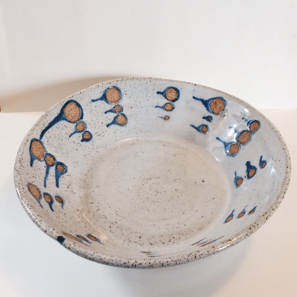 Data Potter by Alice Thudt
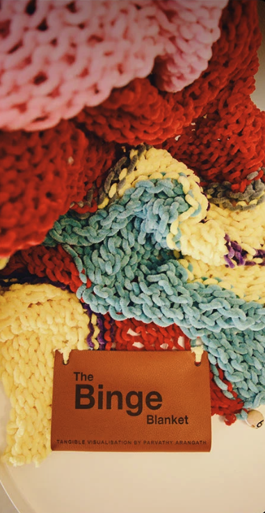 Binge Blanket by Parvathy Raju Arangath
Material forces you to think about data with your hands, not just your eyes. It’s slow by design. You can’t skim a ceramic bowl. And this isn’t new. Punjabi phulkari embroidery encoded data using complex mathematical concepts centuries before spreadsheets existed. My ancestors are from Punjab, and the fact that women who couldn’t read or write were visualising data through stitch counts and colour encoding still amazes me.
6. Performance
In-the-moment. Time-bound. Irreproducible. Embodied and emotional. The audience and the performer affect each other in real time.
Workshops, dance performances, standup comedy, collective data visualisation exercises. At VizChitra 2025, we had a poi performance about climate change. Data communicated through movement, rhythm, and light. You couldn’t pause it. You couldn’t screenshot it. You had to be there.
Performance is the most ephemeral medium on this list, and perhaps the most powerful for creating emotional impact. It asks the audience to feel the data in their bodies, not just process it with their eyes.
Why this matters
Most data visualisation conversations jump straight to form. “Should we make a dashboard or a report?” But that question skips a layer. The prior question is: what kind of experience should this be? Private or shared? Fixed or updateable? Reflective or visceral?
When we pick a medium, we’re making a storytelling decision. The medium shapes what the audience feels, how long they spend with the data, whether they can revisit it, whether they experience it alone or with others.
I wrote about a related idea a few years ago, about how journalistic story structures apply to data storytelling. That post was about the sequence of a story. This one is about the experience of a story.
This comes from The Craft of Building Stories with Data on Open Visualisation Academy. The lesson slides are downloadable from the course page.