Originally posted as a thread on X.

Scouring through Mike Bostock’s AMA now — going to tweet my favorite bits.

“Once you start thinking about design it becomes impossible to stop, and often greatly frustrating to see so many examples of bad design…”

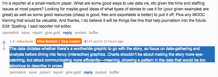
THIS. All day. Everyday. “The data dictates whether there’s a worthwhile graphic to go with the story.”

Reddit AMA screenshot. A reporter at a small-medium paper asks about good ways to use data vis given time and staffing constraints. Bostock replies: "The data dictates whether there's a worthwhile graphic to go with the story, so focus on data-gathering and analysis before diving into fancy (interactive) graphics. Charts shouldn't be about making the story more eye-catching, but about communicating more efficiently — meaning, showing a pattern in the data that would be too laborious to describe in prose."

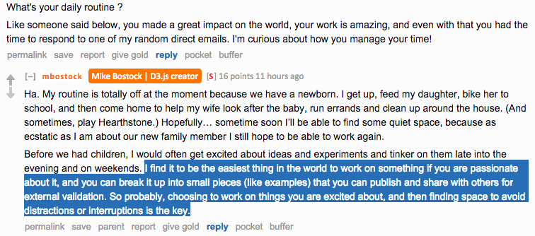
Break passion projects into small pieces that you can publish and share with others for external validation.

Reddit AMA screenshot. Asked about his daily routine, Bostock replies: "My routine is totally off at the moment because we have a newborn." He adds: "I find it to be the easiest thing in the world to work on something if you are passionate about it, and you can break it up into small pieces (like examples) that you can publish and share with others for external validation. So probably, choosing to work on things you are excited about, and then finding space to avoid distractions or interruptions is the key."

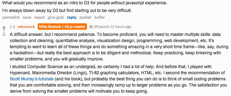
Keep practicing, keep tinkering with smaller problems. Success with smaller problems will keep you motivated.

Reddit AMA screenshot. Asked for recommendations for learning D3 without javascript experience, Bostock replies: "A difficult answer, but I recommend patience. To become proficient, you will need to master multiple skills: data collection and cleaning, quantitative analysis, visualization design, programming, web development, etc. It's tempting to want to learn all of these things and do something amazing in a very short time frame — like, say, during a hackathon — but really the best approach is to be diligent and methodical. Keep practicing, keep tinkering with smaller problems, and you will gradually improve." He adds: "probably the best thing you can do is to think of small coding problems that you are comfortable solving, and then increasingly ramp up to larger problems as you go. The satisfaction you derive from solving the smaller problems will motivate you to keep going."

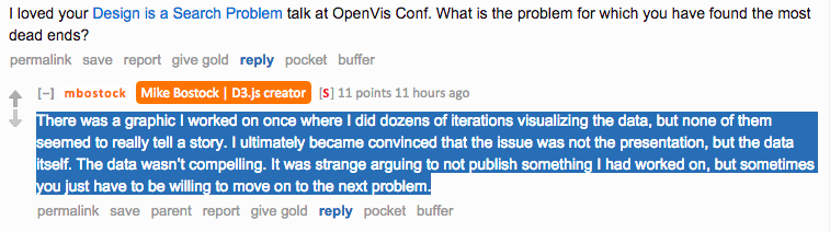
“Sometimes you just have to be willing to move on to the next problem.”

Reddit AMA screenshot. Asked about the problem with the most dead ends, Bostock replies: "There was a graphic I worked on once where I did dozens of iterations visualizing the data, but none of them seemed to really tell a story. I ultimately became convinced that the issue was not the presentation, but the data itself. The data wasn't compelling. It was strange arguing to not publish something I had worked on, but sometimes you just have to be willing to move on to the next problem."

Q. What do you think are the hardest unsolved problems in the field of dataviz? Bostock: How to get people to stop making 3D pie charts.

The AMA led me to this: MathBox. MathBox is totally crazy.
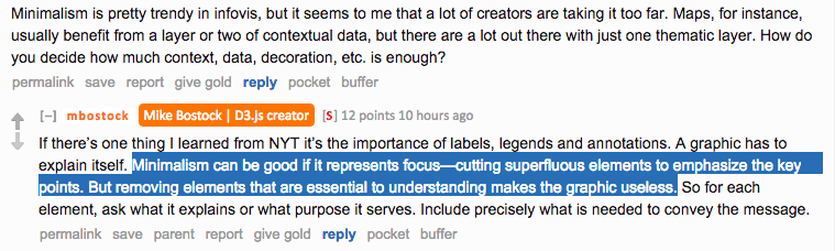
On minimalism.

Reddit AMA screenshot. Asked about minimalism going too far in infovis, Bostock replies: "If there's one thing I learned from NYT it's the importance of labels, legends and annotations. A graphic has to explain itself. Minimalism can be good if it represents focus — cutting superfluous elements to emphasize the key points. But removing elements that are essential to understanding makes the graphic useless. So for each element, ask what it explains or what purpose it serves. Include precisely what is needed to convey the message."

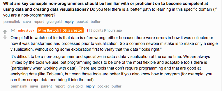
A common mistake is to make a single viz, without doing some exploration to verify that the data “looks right.”

Reddit AMA screenshot. Asked about key concepts non-programmers should know for data visualization, Bostock replies: "One pitfall to watch out for is that data is often wrong, either because there were errors in how it was collected or how it was transformed and processed prior to visualization. So a common newbie mistake is to make only a single visualization, without doing some exploration first to verify that the data looks right. It's difficult to be a non-programmer and specialize in data visualization at the same time. We are always limited by the tools we use, but programming tends to be one of the most flexible and adaptable tools there is."

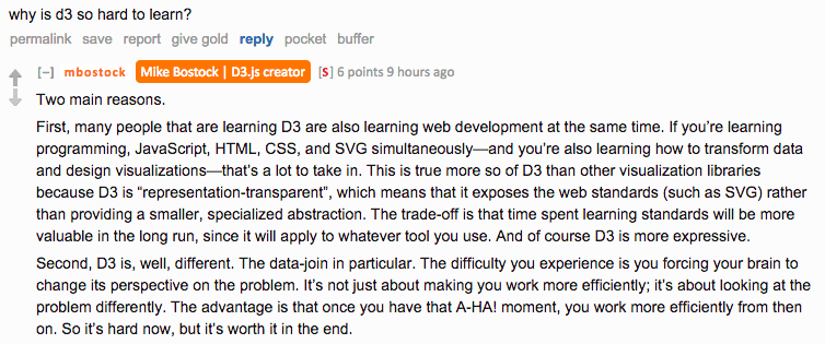
Need to frame this. “It’s hard now, but it’s worth it in the end.”

Reddit AMA screenshot. Asked why D3 is so hard to learn, Bostock replies: "Two main reasons. First, many people that are learning D3 are also learning web development at the same time. If you're learning programming, JavaScript, HTML, CSS, and SVG simultaneously — and you're also learning how to transform data and design visualizations — that's a lot to take in. This is true more so of D3 than other visualization libraries because D3 is representation-transparent, which means that it exposes the web standards (such as SVG) rather than providing a smaller, specialized abstraction. Second, D3 is, well, different. The data-join in particular. The difficulty you experience is you forcing your brain to change its perspective on the problem. The advantage is that once you have that A-HA! moment, you work more efficiently from then on. So it's hard now, but it's worth it in the end."

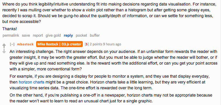
Your audience is important.

Reddit AMA screenshot. Asked about legibility and intuitive understanding in data visualisation decisions, Bostock replies: "An interesting challenge. The right answer depends on your audience. If an unfamiliar form rewards the reader with greater insight, it may be worth the greater effort. But you must be able to judge whether the reader will bother, or if they will give up and read something else. Is the reward worth the additional effort, or can you get your point across with a simpler, more conventional form? For example, if you are designing a display for people to monitor a system, and they use that display everyday, then horizon charts might be a great choice. On the other hand, if you're publishing a one-off in a newspaper, horizon charts may not be appropriate because the reader won't want to learn to read an unusual chart just for a single graphic."