Originally posted as a thread on X.

Two days late — but here are my favorite bits from Alberto Cairo’s recent AMA.

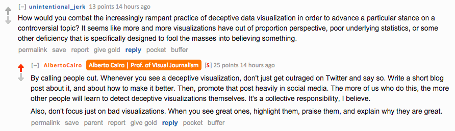
Whenever you see a deceptive visualization, call it out. Write a short blog post about it, how to make it better.

Reddit AMA screenshot. Question from unintentional_jerk: "How would you combat the increasingly rampant practice of deceptive data visualization in order to advance a particular stance on a controversial topic?" Cairo replies: "By calling people out. Whenever you see a deceptive visualization, don't just get outraged on Twitter and say so. Write a short blog post about it, and about how to make it better. Then, promote that post heavily in social media. The more of us who do this, the more other people will learn to detect deceptive visualizations themselves. It's a collective responsibility, I believe. Also, don't focus just on bad visualizations. When you see great ones, highlight them, praise them, and explain why they are great."

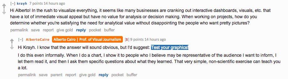
Like everything else, one important strategy for graphics — user testing.

Reddit AMA screenshot. Question from krayh: "In the rush to visualize everything, it seems like many businesses are cranking out interactive dashboards, visuals, etc. that have a lot of immediate visual appeal but have no value for analysis or decision making. How do you determine whether you're satisfying the need for analytical value without disappointing the people who want pretty pictures?" Cairo replies: "Hi Krayh. I know that the answer will sound obvious, but I'd suggest: Test your graphics. I do this even informally. When I do a chart, I show it to people who I believe may be representative of the audience I want to inform, I let them read it, and then I ask them specific questions about what they learned. That very simple, non-scientific exercise can teach you a lot."

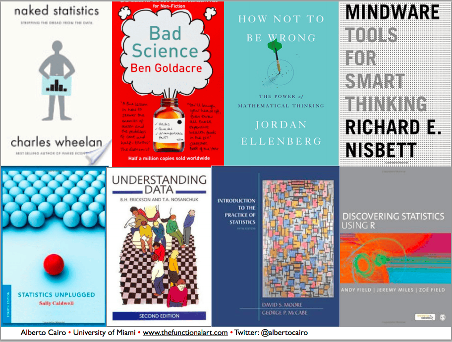
Cairo’s favorite statistics books.

Book covers of Cairo's favorite statistics books: Naked Statistics by Charles Wheelan, Bad Science by Ben Goldacre, How Not To Be Wrong by Jordan Ellenberg, Mindware: Tools for Smart Thinking by Richard E. Nisbett, Statistics Unplugged by Sally Caldwell, Understanding Data by Erickson and Nosanchuk, Introduction to the Practice of Statistics by David S. Moore and George P. McCabe, and Discovering Statistics Using R by Andy Field, Jeremy Miles and Zoe Field.

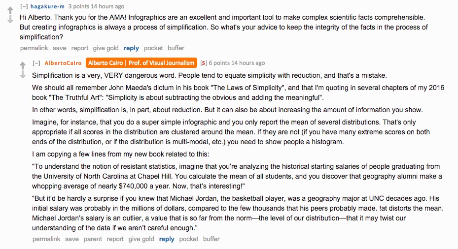
“Simplicity is about subtracting the obvious and adding the meaningful.”

More on simplicity v/s reduction:

Reddit AMA screenshot. Question from hagakure-m: "Creating infographics is always a process of simplification. So what's your advice to keep the integrity of the facts in the process of simplification?" Cairo replies: "Simplification is a very, VERY dangerous word. People tend to equate simplicity with reduction, and that's a mistake. We should all remember John Maeda's dictum in his book The Laws of Simplicity, and that I'm quoting in several chapters of my 2016 book The Truthful Art: Simplicity is about subtracting the obvious and adding the meaningful. In other words, simplification is, in part, about reduction. But it can also be about increasing the amount of information you show." He then gives the example of resistant statistics using UNC geography alumni salaries distorted by Michael Jordan's outlier salary.

“…great visualizations should be truthful, functional, beautiful, insightful, and enlightening. There’s a hierarchy in those values.”

Reminder from Edward Tufte’s work: If your data is boring, it’s probably because you’re showing the wrong data.

More books: Design for Information — Isabel Meirelles, Show me the Numbers — Stephen Few, Thematic Cartography and Visualization — Terry Slocum.

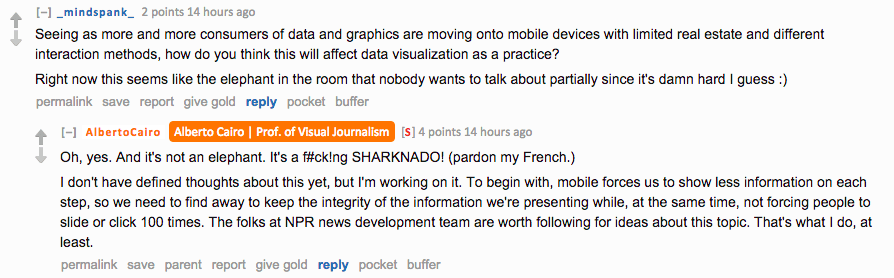
One of the smartest things NPR Viz did a while ago: desktop → small multiples, phone → GIFs.

Reddit AMA screenshot. Question from _mindspank_: "As more consumers of data and graphics are moving onto mobile devices with limited real estate and different interaction methods, how do you think this will affect data visualization as a practice?" Cairo replies: "Oh, yes. And it's not an elephant. It's a f#ck!ng SHARKNADO! (pardon my French.) I don't have defined thoughts about this yet, but I'm working on it. To begin with, mobile forces us to show less information on each step, so we need to find away to keep the integrity of the information we're presenting while, at the same time, not forcing people to slide or click 100 times. The folks at NPR news development team are worth following for ideas about this topic."

In Alberto Cairo’s opinion — The biggest problem in visualization nowadays, particularly in news viz, is with the reasoning behind graphics.

Confirmation bias — most people use data not to challenge themselves, but to strengthen their own ideas.

Reddit AMA screenshot. Cairo writes: "Some studies have shown that most people use data not to challenge themselves, but to strengthen their own ideas. This is called the confirmation bias. However, there are ways to overcome this, I believe. Critical thinking can and should be taught at all levels of education. I am not talking about the leftist dogma some of were forced to endure in journalism school, but scientific reasoning, elementary statistics, and logic. There's a famous quote about this: You cannot reason someone out of something he or she was not reasoned into. This is certainly true in the short term, but NOT in the long term."

Also discovered this — The art and science of the scatterplot.

And… Bar Chart Baselines Start at Zero.

Visualizations exist on a truth continuum: arguments… charts, maps, visualizations, any act of human reasoning and communication are never fully “true” or “untrue”, but “truer” or “untruer.”