Everything We Did at Reuters Graphics on the Coronavirus
Originally posted as a thread on X.
Here is a thread with everything we have done at Reuters Graphics on the new coronavirus.
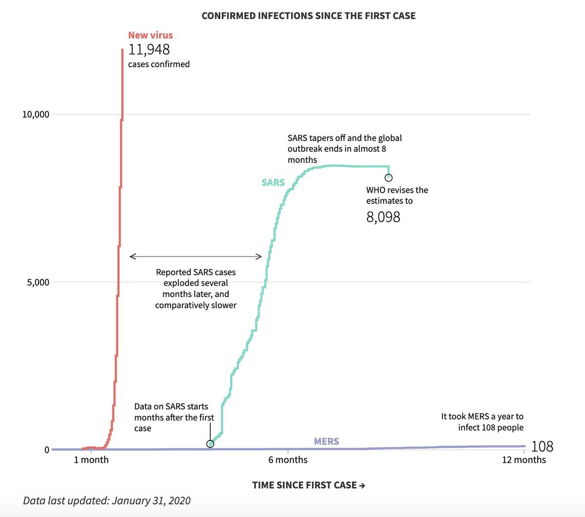
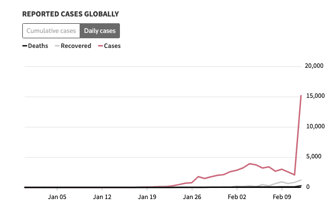
Track where the virus has spread. As of this morning, we are looking at 11,948 cases globally.
Want to learn about the genetics and science behind the virus? How closely is it linked to the common cold? How does it transmit from person to person? Here is a visual explainer.


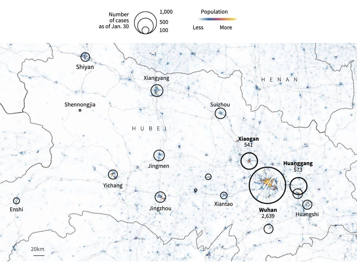
The epicentre of the outbreak is expanding from Wuhan to the nearby cities of Xiaogan and Huanggang.
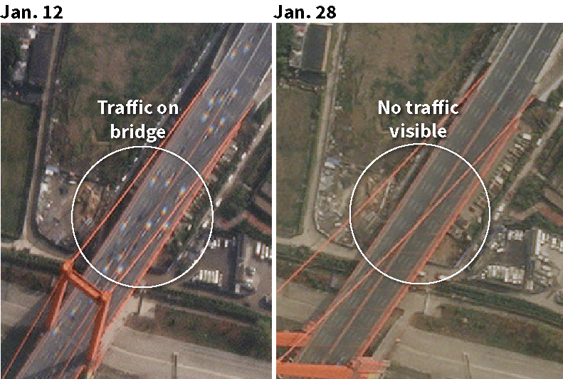
Satellite images show Wuhan’s empty streets.
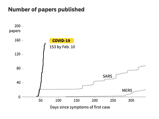
Compared to SARS and MERS, the new coronavirus has infected more people in a shorter span of time.
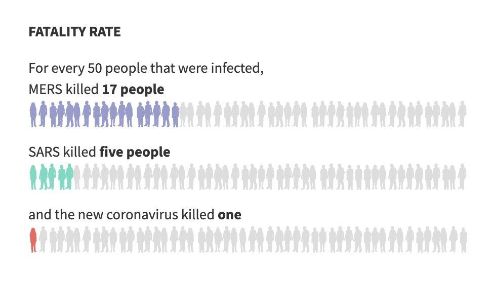
The new coronavirus is less fatal than SARS and MERS.
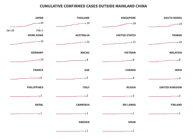
How cases have been increasing outside Mainland China.
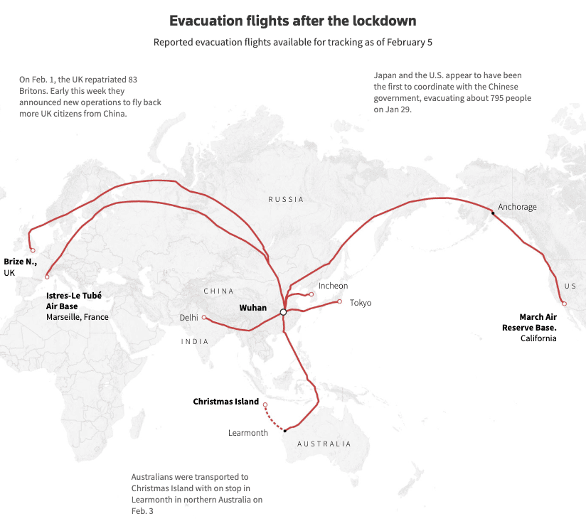
A look at all the evacuations by Marco Hernandez.
More testing capacity = More cases. That huge spike after Hubei started using CT scans for confirmation of infections.
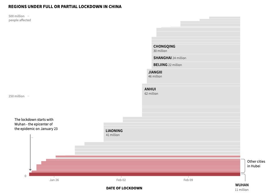
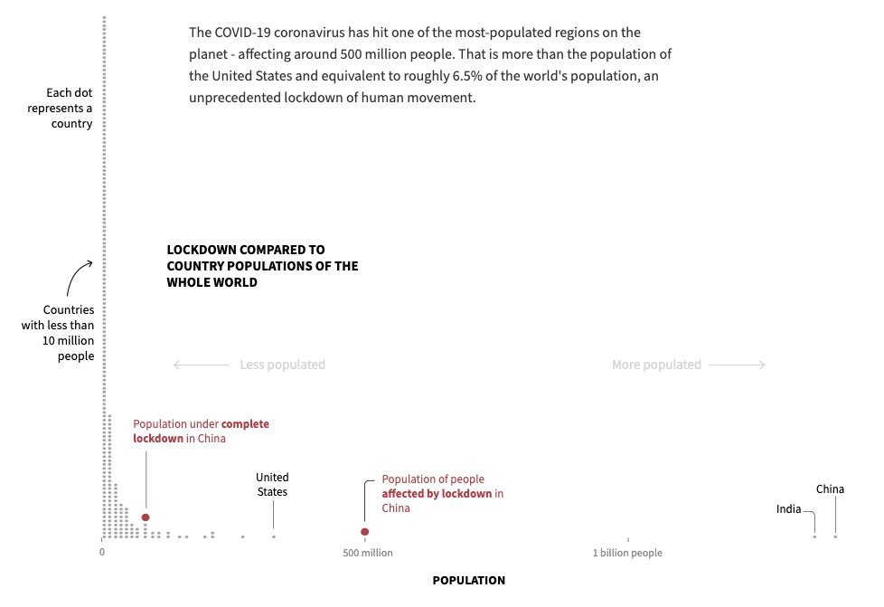
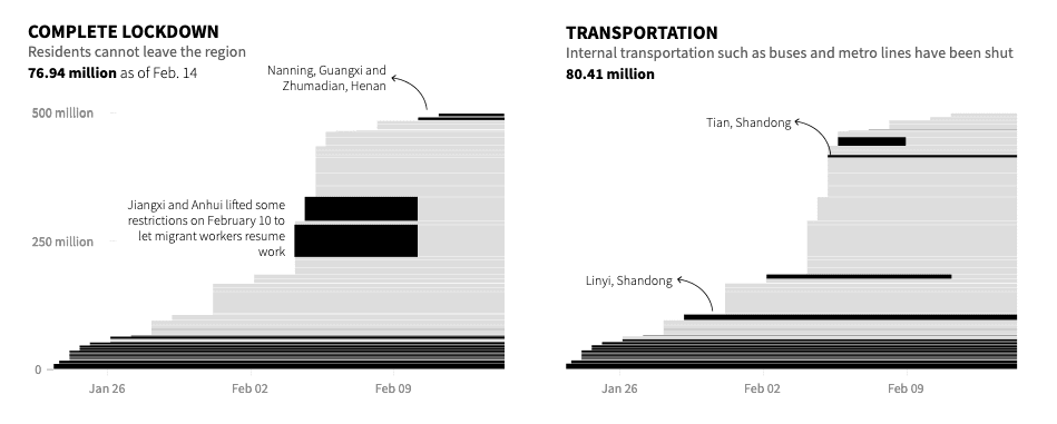
Around 500 million people in China are currently affected by policies put in place restricting movement, to contain COVID-19. Charts that show the full scale of the lockdown.
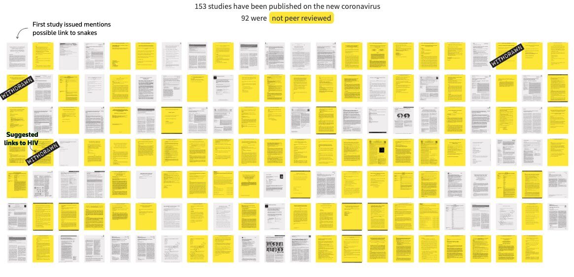
Manas and Simon Scarr look at the emergence of “speed science” with regard to the new coronavirus. A lot more papers, mostly not peer reviewed.
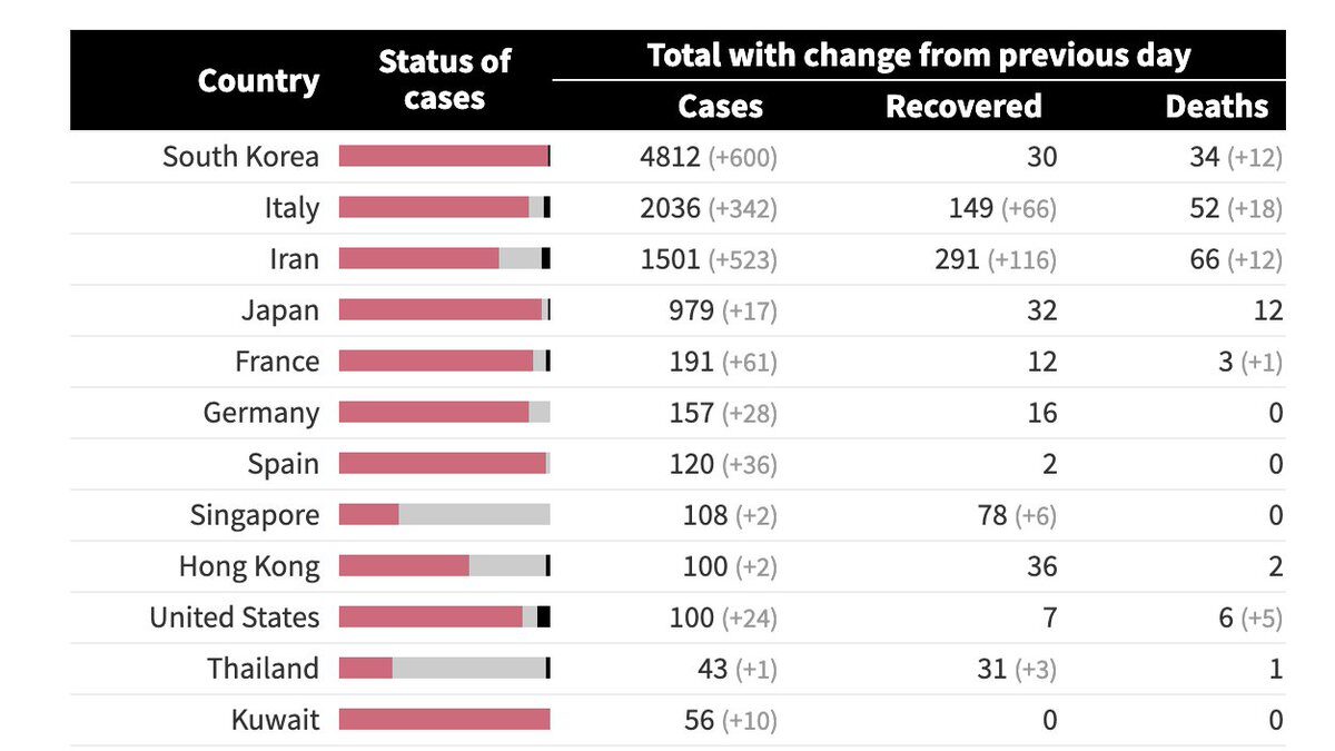
75 countries and territories have reported infections of coronavirus so far. A look at the status of cases.
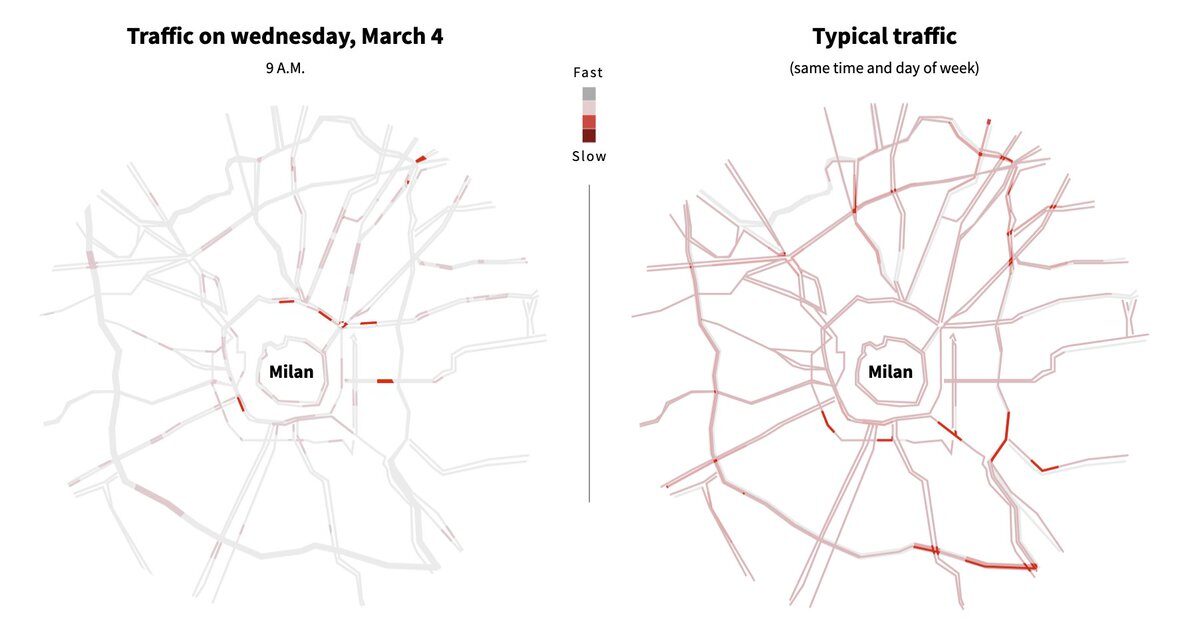
A look at how traffic in Italy has been affected after it became the worst-hit country by the coronavirus in Europe. By Simon Scarr and Samuel Granados.
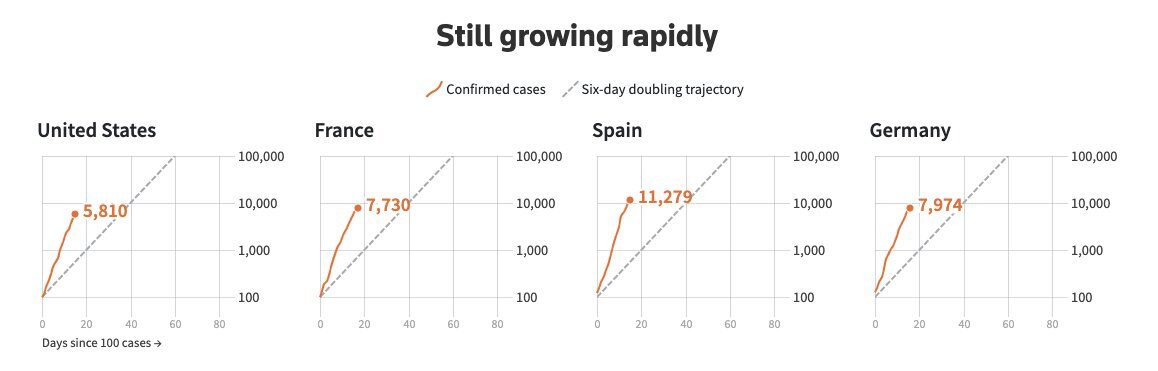
Chris Canipe on the exponential growth.
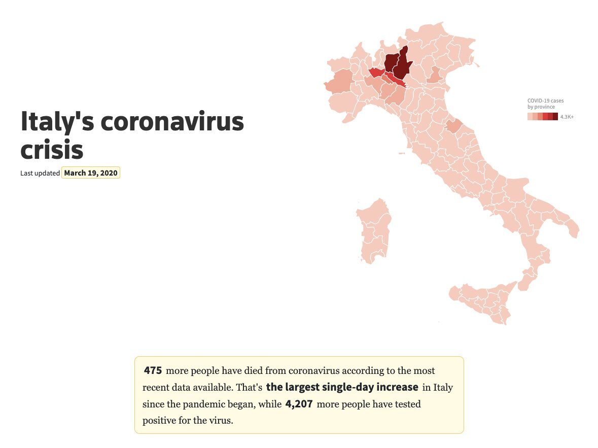
Jon McClure and the team in London with updates on the statistics in Italy.
As the number of confirmed COVID-19 cases continues to rise, more than 100 countries have declared or implemented nationwide or localized shutdowns of educational institutions. By Aditi Bhandari and Prasanta Kumar Dutta.
How much countries test is a huge factor in this race against the virus. Feilding Cage looked at the global testing numbers and which countries are leading. India is at 10 tests per million. Norway is at 6,400+.
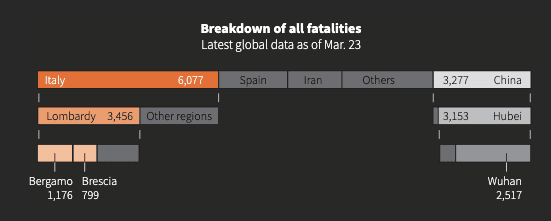
Every 3 mins 35 secs, someone infected with coronavirus is dying in the Italian region of Lombardy. Manas and Simon Scarr on how Lombardy has become the single deadliest coronavirus hotspot on the planet.
As Europe becomes the epicentre of the pandemic, Samuel Granados and Prasanta Kumar Dutta look at the state of lockdowns across the region.
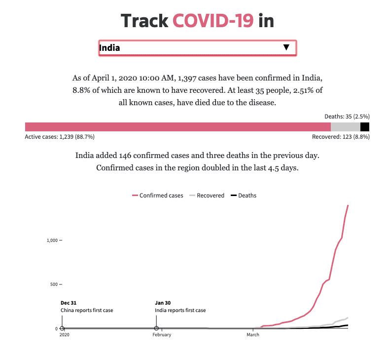
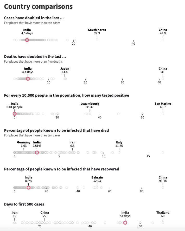
Want to see coronavirus data for certain countries? Just added country specific trackers. Here is one for India.
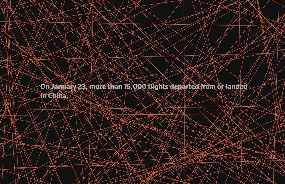
Basile Simon, Michael Ovaska, and Reade Levinson look at how commercial flights have plummeted because of the coronavirus outbreak.

A new way of visualising the curves. Wave charts from Jon McClure.
This beautiful and powerful piece on the spread of the virus in China by Marco Hernandez and Cate Cadell.
Illustrations from Samuel Granados to show the role ventilators play when dealing with COVID-19.
The explosion of cases in Singapore’s foreign worker dormitories.