My Kadhi Visualisation in the Data Cook Book
Originally posted on LinkedIn.
My copy of Market Cafe Magazine’s Data Cook Book arrived last week and I am very excited to share my visualisation about “Kadhi” — my favourite dish of all time! I decided to do it as a decision tree/flow chart visualisation.
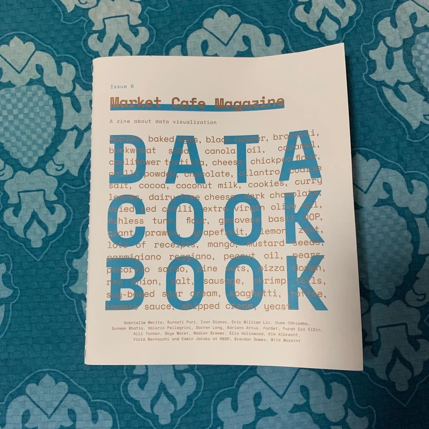 The Data Cook Book — Issue 6 of Market Cafe Magazine, a zine about data visualisation.
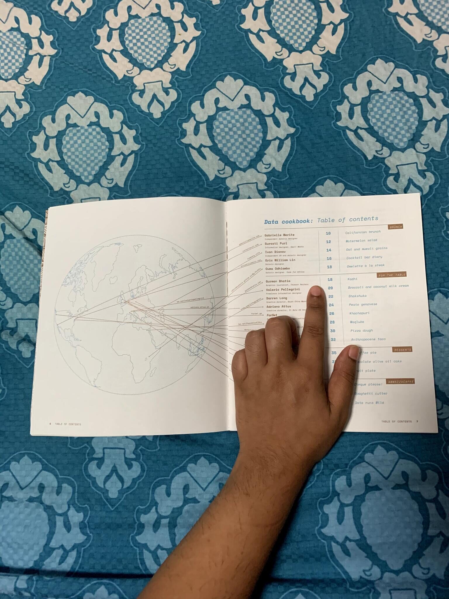 The table of contents — contributors from around the world, and my Kadhi on page 18.
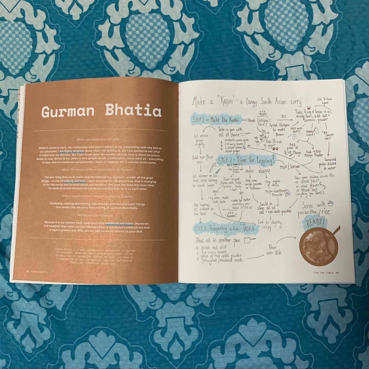 The full spread — my bio alongside the Kadhi decision tree.
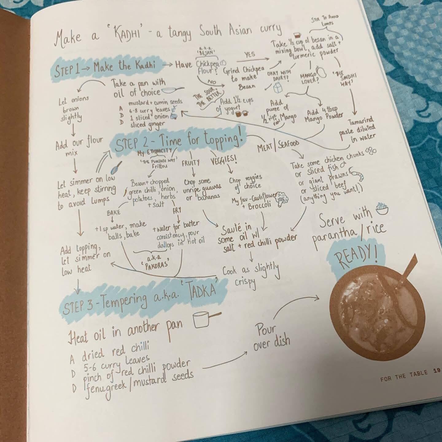 A closer look at the flowchart — three steps to making Kadhi, entirely hand-drawn.
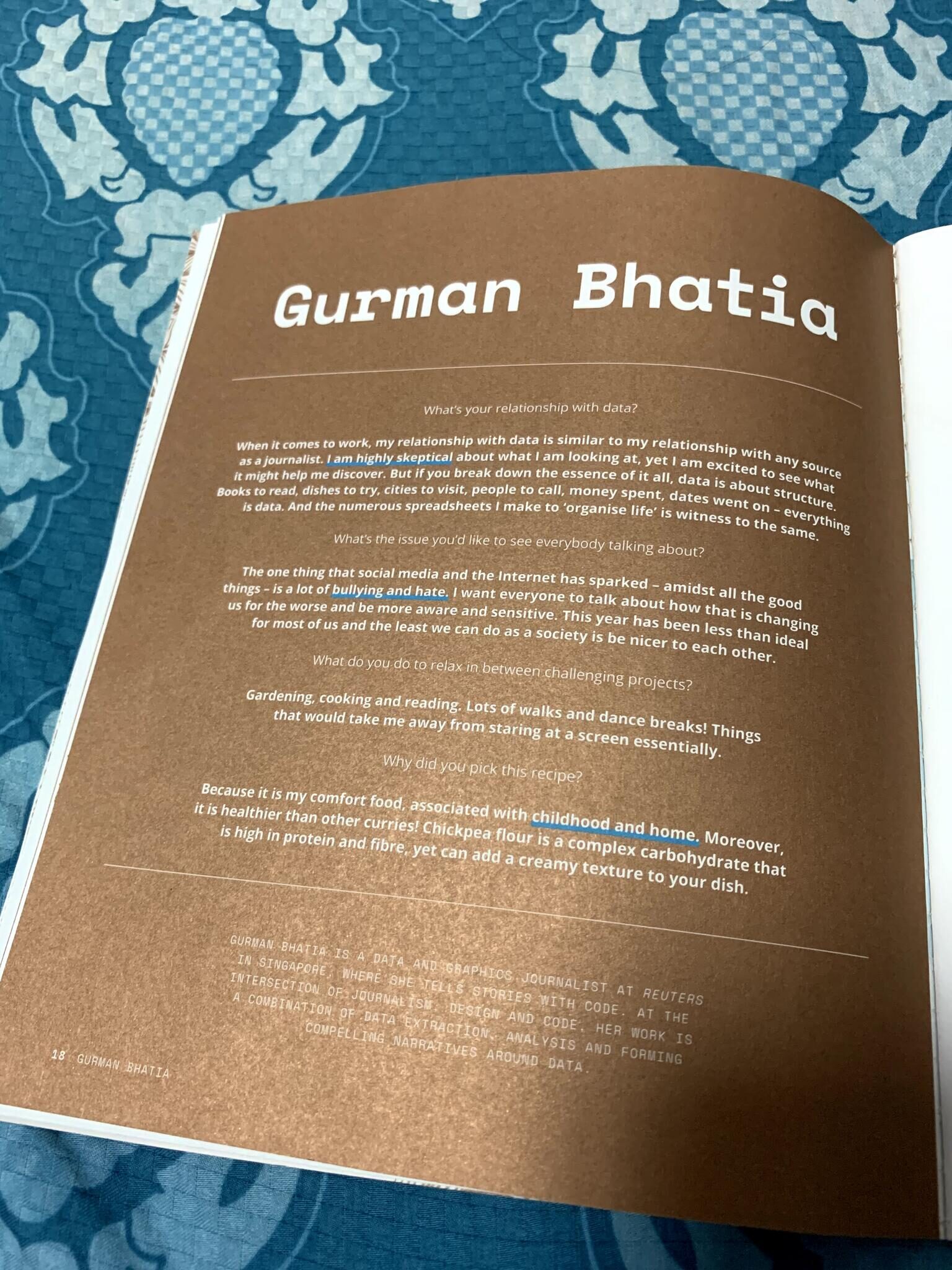 The bio page — why Kadhi, and my relationship with data.
This is personally special in many ways!
- First time I’ve published a graphic in a magazine.
- First time I’ve done a graphic entirely by hand!
- First time I’ve combined my love for cooking and data visualisation!
The zine features some other cool visualisations about food as well!